
We turned yet another corner in the seemingly endless Schönbrunn Palace Maze.
It was cold.
I was hungry.
My feet were tired.
A five-alarm toddler tantrum was brewing. Mine!
My super excited five-year-old son eagerly led me by the hand at great speed, down passageways and taking random turns at intersections.
Unexpectedly we emerged from the labyrinth. Hoorah! Time for lunch.
My brief elation was cruelly dashed by the strategic placement of a children’s playground between the maze exit and the coffee shop.
Curse you gods of urban planning!
Faster than I could say “sandwich” the boy streaked off like a greyhound on cocaine.
After much climbing, jumping, digging and swinging he called me over to a spectacular array of funfair mirrors. He contagiously cackled as our distorted reflections had us looking like extras in a “Despicable Me” movie.
Perspective is a wonderful thing
Sometime later, while refuelling on a restorative flatbread toastie, I skimmed through the latest collection of articles in Feedly.
One contained the oft-repeated factoid that “less than half the population works, and barely more than a third of the population works full time”.
That got me thinking.
Could it be true?
Is it based on perception, like our distorted reflections in the funfair mirror?
Or, like many statistics, is it just something the author had made up on the spot?
To find out the answer, I decided to delve into the maze that is demographic statistics.
the United Kingdom population
According to the Office of National Statistics, at the time of writing there were over 66 million people living in the United Kingdom. The vast majority of them can be found crammed onto the Central Line at peak hour!
The first chart breaks that population down by gender and age.
Government defined age constraints delineate the various financial life phases that a member of society progresses through. I have applied shading to highlight those age bands.
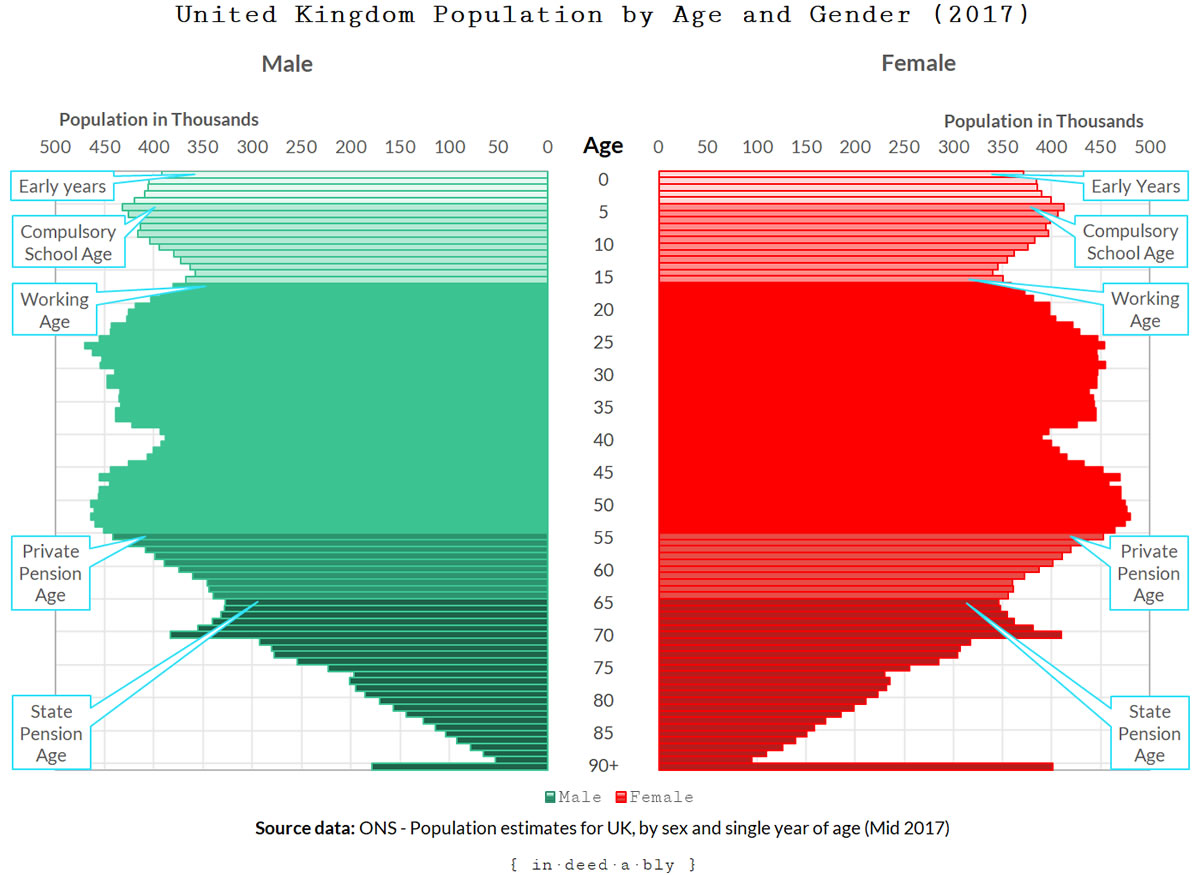
At first glance the “half the population doesn’t work” claim looks like it is probably exaggerated. Children and retirees bookend the journey through life, but when combined, the two groups do not appear to be a match in size for the working age demographic bulge.
In these days of low unemployment rates, there couldn’t possibly be so many people seeking work to account for the difference. Could there?
Are workers really the minority?
The second chart looks like a colour blind toddler got stuck into the crayons.
It applies the employment, unemployment and economic inactivity rates from the ONS Employment survey to the earlier chart.
Employment is further broken down into full-time and part-time work, using the proportions contained in the ONS Earnings and Work Hours survey.
I have applied the same age band shading to the full-time worker data, to highlight the financial life phases.
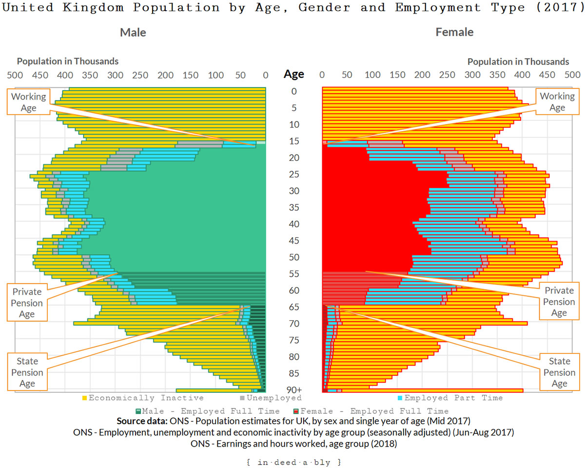
Note this results in a “crime against charts”, as the Earnings survey is denominated by the number of jobs, not the number of people performing those jobs. Therefore a person working multiple jobs would be counted multiple times.
The goal of this chart is to bring to life the story the data has to tell, painting a picture of the general patterns. For the purpose of being able to validate or call bullshit on the claims that half of society doesn’t work at all, and two-thirds of society doesn’t work full-time, the data is probably accurate enough.
Does it appear that half the population doesn’t work at all? This is represented by the unemployed (shaded grey), and the economically inactive (shaded yellow).
These areas do appear to represent roughly half.
Economically inactive is just a fancy way of saying not working in a paying job, and not officially looking for work either. School kids, students, “house spouses”, stay-at-home-parents, and retirees would all be considered economically inactive according to the ONS definition.
How about the claim that only just over a third of the population hold a full-time job?
To my eyes, the full-time worker segment of the chart appears to represent more than a third but certainly less than half. The claim may be a bit of an exaggeration, but it appears to be in the right ballpark.
Demagoguery
While exploring through the maze of ONS data, I found a census dataset about countries of birth.
The current political environment is full of nationalistic propaganda about Britain being overrun by teeming hordes of foreigners. The line of reasoning behind this demagoguery is that migrants and visa holders are in Britain “taking our jobs, stealing our women, and not paying any taxes”.
I decided to validate that assertion.
A limitation of the census data is that it is starting to become dated, the last census being conducted back in 2011. To compensate for this, I derived the percentage splits by age and gender of the population born in the United Kingdom and those born elsewhere.
I then applied those proportions to the population data used for the previous charts.
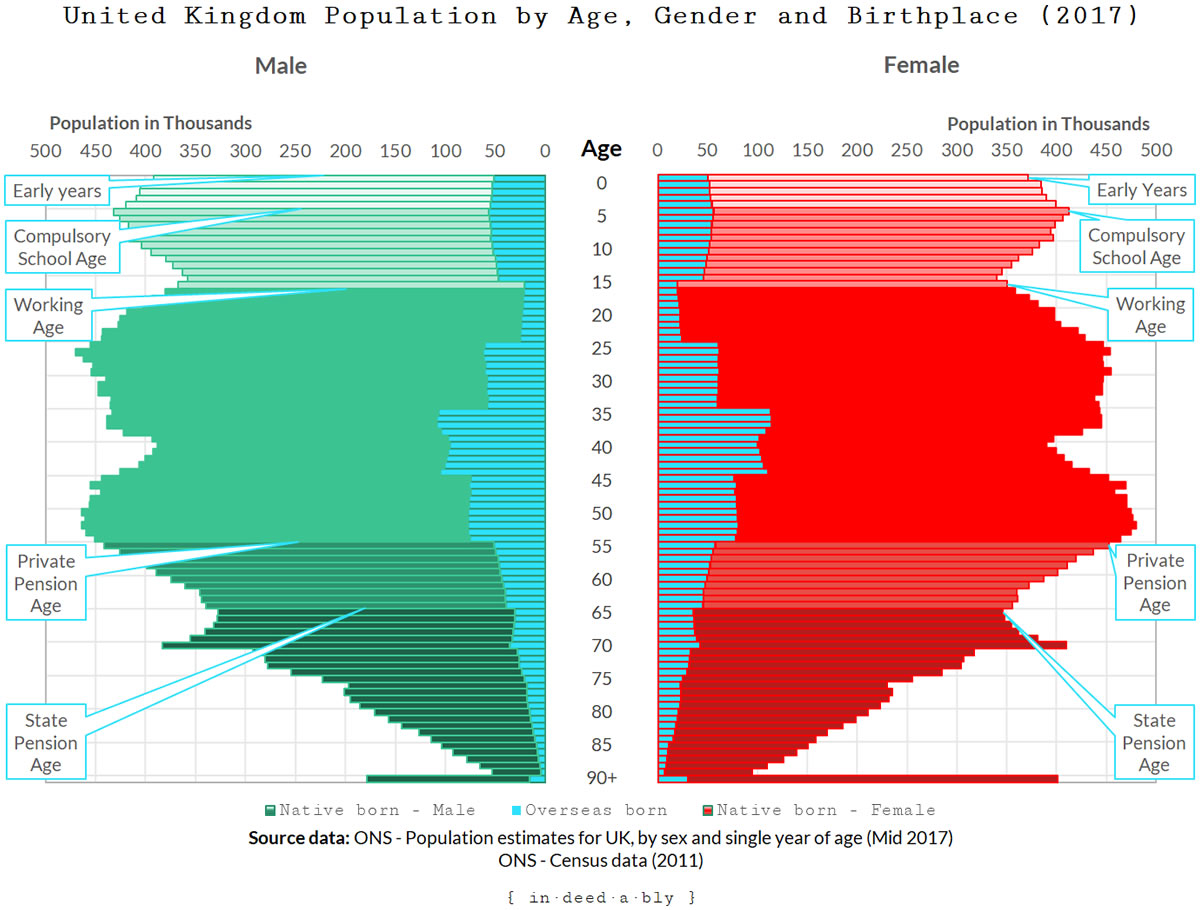
The chart does tell a story, but not one that supports the invasion of foreigners narrative. I call bullshit on that claim.
Note the birth location data is reported by age bands, rather than individual years, giving the born overseas series a stepped appearance.
An independent London?
Another frequently repeated assertion is that rather than Brexit-ing, London should declare independence from the rest of the United Kingdom.
The argument seems to be that a Singapore style city-state, possessing both the City and Heathrow Airport, would be an economic powerhouse free from propping up the economic “dead weight” regions located north and west of the M25 motorway.
This is an intriguing notion.
As a migrant to the United Kingdom, I don’t have the ingrained sense of tribal identity that comes from being born and raised in one of Britain’s home nations.
I reside in London, and have done so long enough to think of myself as a “Londoner”. I possess a British passport, and have learned to write British as my nationality on official forms and documents.
However I have never thought of myself as English.
It turns out this is a pretty common worldview amongst migrants to the United Kingdom.
So regardless of what I may personally think about the London independence debate, I don’t experience the same visceral sense of horror at the prospect that I suspect many born and bred English people probably do.
The next chart illustrates the population distribution by age and gender across the United Kingdom’s home nations, with London broken out from England.
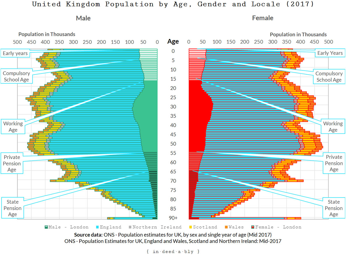
It turns out England (not including London) has a much higher population than I had realised. The population of Greater London (as defined by the 32 London boroughs plus the City of London) is smaller than I thought it would be.
According to the ONS, Greater London has nearly 9 million people currently living within it. A London city-state would have a population larger those possessed by half the EU member countries.
The London city-state would have an area of 1,572 square kilometres, making it the second smallest EU nation, between Malta and Luxembourg. It would be more than double the size of Singapore.
Would an independent London city-state make sense? Who knows. It certainly has sufficient size and population for the debate to not be dismissed out of hand.
A thought about demographic attributes
Age and gender demographic attributes were once the go-to classifiers of choice for generations of statisticians and unimaginative reporting analysts. Both were once objective and fact-based.
In an ever more complicated world, that assumption no longer holds true for either gender nor age.
Regardless of whether you believe that change represents embracing nuance and inclusivity, or indulging in ridiculous fantasy, it will certainly make demographic reporting more challenging in the future!
References
- Data.gov.sg (2018), ‘Total Land Area of Singapore‘
- European Union (2018), ‘Size and population‘
- Eurostat (2018), ‘Population on 1 January (tps00001)‘
- Greater London Authority (2018), ‘Land Area and Population Density, Ward and Borough‘
- Office of National Statistics (2018), ‘A05 SA: Employment, unemployment and economic inactivity by age group (seasonally adjusted)‘
- Office of National Statistics (2018), ‘DC2103EW – Country of birth by sex by age‘
- Office of National Statistics (2018), ‘Earnings and hours worked, age group: ASHE Table 6‘
- Office of National Statistics (2018), ‘Estimates of the population for the UK, England and Wales, Scotland and Northern Ireland‘
- Office of National Statistics (2018), ‘Overview of the UK population: November 2018‘
- Office of National Statistics (2018), ‘Population of the UK by country of birth and nationality‘
Featured by

youngfiguy 9 November 2018
Nice try Indeedably! I’ve posted the numbers and sources now in the comments for those interested. For reference about 49% of the total population are in work (seasonally adjusted). Of those in work, about 75.5% are full time employed. The ONS data is a little noisy as its survey-based, though it is reliable.
Curious thing about the London data. My old lady is as London as they come, but she wasn’t born in ‘London’ – rather Essex, like lots of East-Enders. Likewise, I live within the M25 but technically not in London!
This manifests itself in an abominable chart which ‘shows’ inequality within regions in countries in the UK. The UK looks awful, but that’s because one of our ‘regions’ is the City of London!
P. S. Those charts are a crime against charts.
P. P. S. Great post.
{in·deed·a·bly} 9 November 2018 — Post author
Thanks for stopping by Mr YFG, and for supplying the audience with some of the numbers used to generate the visual picture my (crime against) chart attempts to paint.
London is certainly an ill-defined kind of place, organic and unstructured in many facets! When I first arrived in the UK people used to talk about London having a population of ~20 million, a population figure that must have included the home counties… greater Greater London perhaps?
PendleWitch 10 November 2018
Hey, Indeedably.
Did you just admit that, as a Londoner, you didn’t realise there were so many people in the rest of England?! Incontrovertible evidence of the ‘London bubble’?? 🙂
The charts were interesting to see. Why are those 90+ year olds still working full time? Why are there so many people economically inactive in the prime of life?
I tried to spot the Boomers, but apart from the sudden blip in births ~1946, it didn’t seem obvious. I think because mortality is increasing for them/us now. It would need a different graphic, I suppose.
Immigration: I think you’d need to put in a time axis, and also compare with other countries before you can make a judgement. I’m thinking Japan, for example, wouldn’t be showing those volumes.
Thanks for working so hard on the interesting charts – seems like a job, no?
{in·deed·a·bly} 10 November 2018 — Post author
Thanks for reading PendleWitch.
I did indeed. Once again I am ably demonstrating my ignorance in public!
Many grey hairs years ago I spent a couple of months backpacking around Britain, checking out most of the castles and cathedrals (and many of the pubs). Apart from Manchester, and the ridiculous traffic around Peterborough, nowhere I ventured outside of (Greater) London felt big/busy enough to be hiding such a huge population.
Based on these charts, and the commuting research I did the other day, I suspect many of them must have been trekking into London for work.
The age 90+ cohort working full time is a distortion due to the inconsistent cohorts used across the various ONS datasets. The employment survey lumps everyone 60+ into a single catchall cohort. In a “crime against charts” I’ve applied the cohort’s full/part time percentage linearly across the whole age band. This would understate the worker numbers in the younger part of the age band, and overstate them in the latter part as the frailties of age catch up with folks.
When I rule the world, the ONS will freely publish suitably pseudonymised raw data behind all their surveys, linked to conformed mastered reference datasets, to support data geeks like myself making pretty charts and leaping to wild conclusions. Of course the government of the day wouldn’t get to “control the message” then, but as I would be the benevolent dictator in charge that shouldn’t matter all the much!
Definition of a job is getting paid to do something… until that point it is only a hobby!
Caveman 11 November 2018
Nice to see more data against YFG’s points. For me the interesting questions (which I don’t expect you to answer!) are: a) how this compares internationally and b) how this compares over time.
If I were guessing I would expect this to be comparable to the western world and also, given the current levels of employment, for there to be more workers than in most other years. [And I wouldn’t want to to underplay your comments on twitter about the quality of those jobs].
People, including me, react with incredulity to those stats, but I suspect they have held pretty stable over time and geography.
Also, briefly, on the London point. I have a good friend who says that she thinks of herself as Londoner rather than either British or English. I relate to that – and I suspect that we’re not unique. We probably have a lot more in common with people in other major cities around the world than we do with someone in a village in Cumbria.
{in·deed·a·bly} 11 November 2018 — Post author
Thanks for offering your thoughts Caveman.
I think these charts actually support Mr YFG‘s points. The total number of givers and takers is roughly equal in the economy, though there is considerable variation in the contribution of the givers.
From a long term sustainability perspective I have some concerns, though I suspect this is more down to a long term change in demographic behaviour (i.e. people breed less today) more so than a widespread change in attitude or outlook.
weenie 25 November 2018
Very interesting, indeedably.
I’m surprised that the Remain camp didn’t use that ‘overseas’ born graph to confirm that the scare-mongering of foreign hordes was overblown – or maybe I missed that part of the campaign? Too late anyway…
Interesting about the British/English thing – I was born in England, support England in sports but only consider myself British, not English. Maybe it’s just me not wanting to poke the hornets nest of those who are staunchly white English born and bred.
{in·deed·a·bly} 25 November 2018 — Post author
Thanks weenie.
My guess is the Remain camp was (half-heartedly) led by Tories, who had themselves previously campaigned on raising the drawbridge and drastically restricting migrant numbers.
cer4t0n1a 26 November 2018
Very interesting set of data. The local peak in population at age 70/71 makes sense (end of WW 2) but what causes the apparent sharp drop in male full-time employment from age 50 to age 51? I know that police officers used to be able to retire at that age, but that doesn’t seem to be enough people to explain the fall.
{in·deed·a·bly} 26 November 2018 — Post author
Unfortunately the source datasets apply inconsistent age bands when reporting their data.
The ONS Employment, unemployment and economic inactivity by age group (seasonally adjusted) dataset groups everyone aged 50-64 into a single cohort.
This dataset presents the cohort total, but insufficient age data to accurately break that down by individual age. It is likely that increasing proportions of the cohort would be exiting the workforce the nearer they got to the upper band limit, but any apportionment rule applied would have been arbitrary.
On the chart I have applied the corresponding pro-rated proportion of the population for each age so that the overall numbers of people remain consistent.
cerat0n1a 26 November 2018
OK, makes sense. The household net wealth ONS data makes for interesting reading. From memory, you need around £3 million to be in the top 1%.
Seems like London has disproportionately few children and elderly people relative to the rest of the UK and is the only place where there are more 18-39 women than men of the same age. I wonder whether young women are more likely to move to London for work than men?
{in·deed·a·bly} 26 November 2018 — Post author
You raise an interesting question cerat0n1a.
My guess would be that working age people (mostly) move where the jobs are, and more specifically where the chargeable value of their time is the highest.
At the same time the housing costs located near those higher paying jobs are likely to be significantly larger than those further afield.
Therefore if you didn’t need to live close to the jobs, or you needed more space for a young family, then conventional wisdom has it you get more bang for your buck out of town. I did an analysis that touched on this a while back.